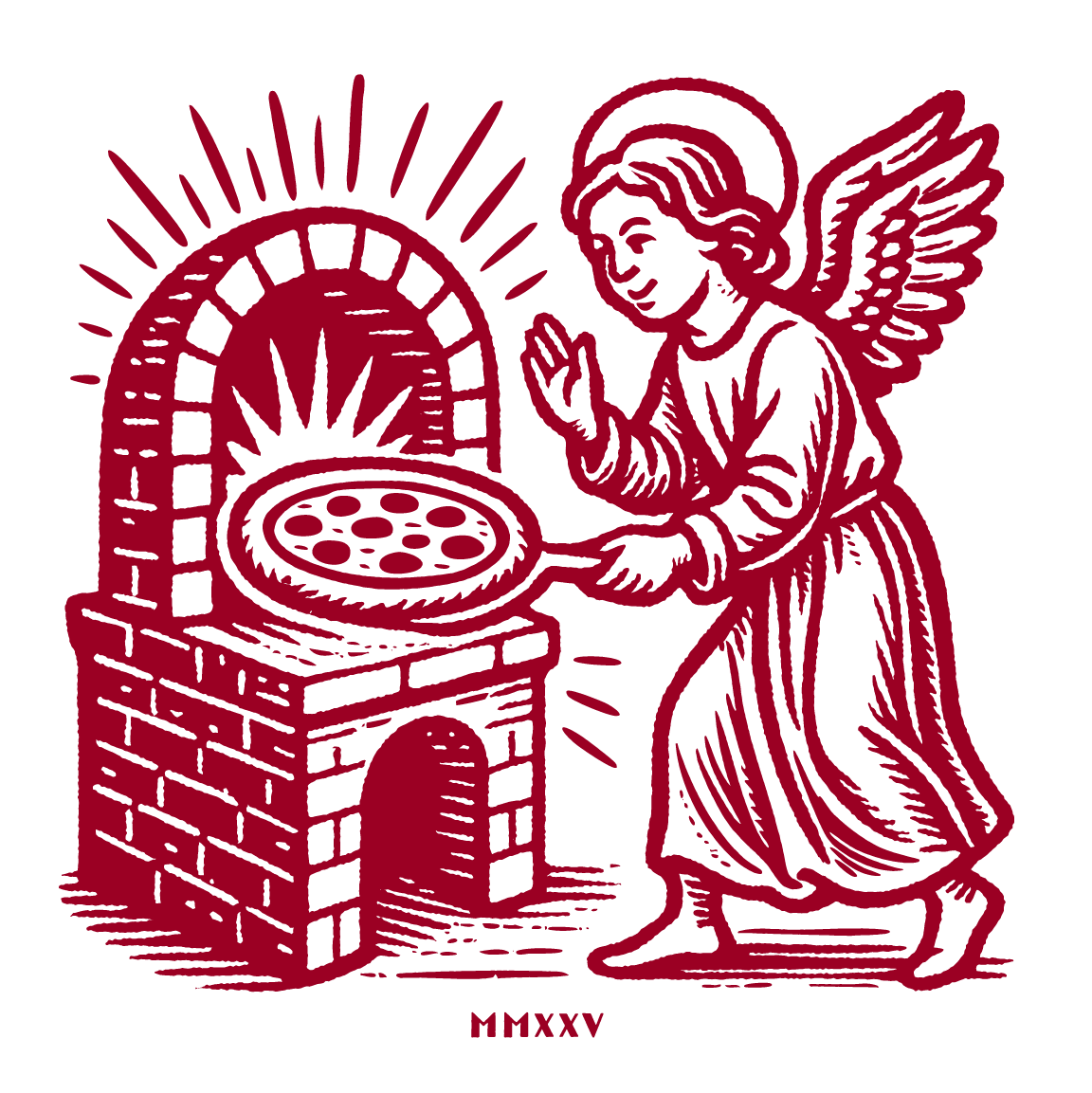
The Holy Oven.
Glory be to Sauce!
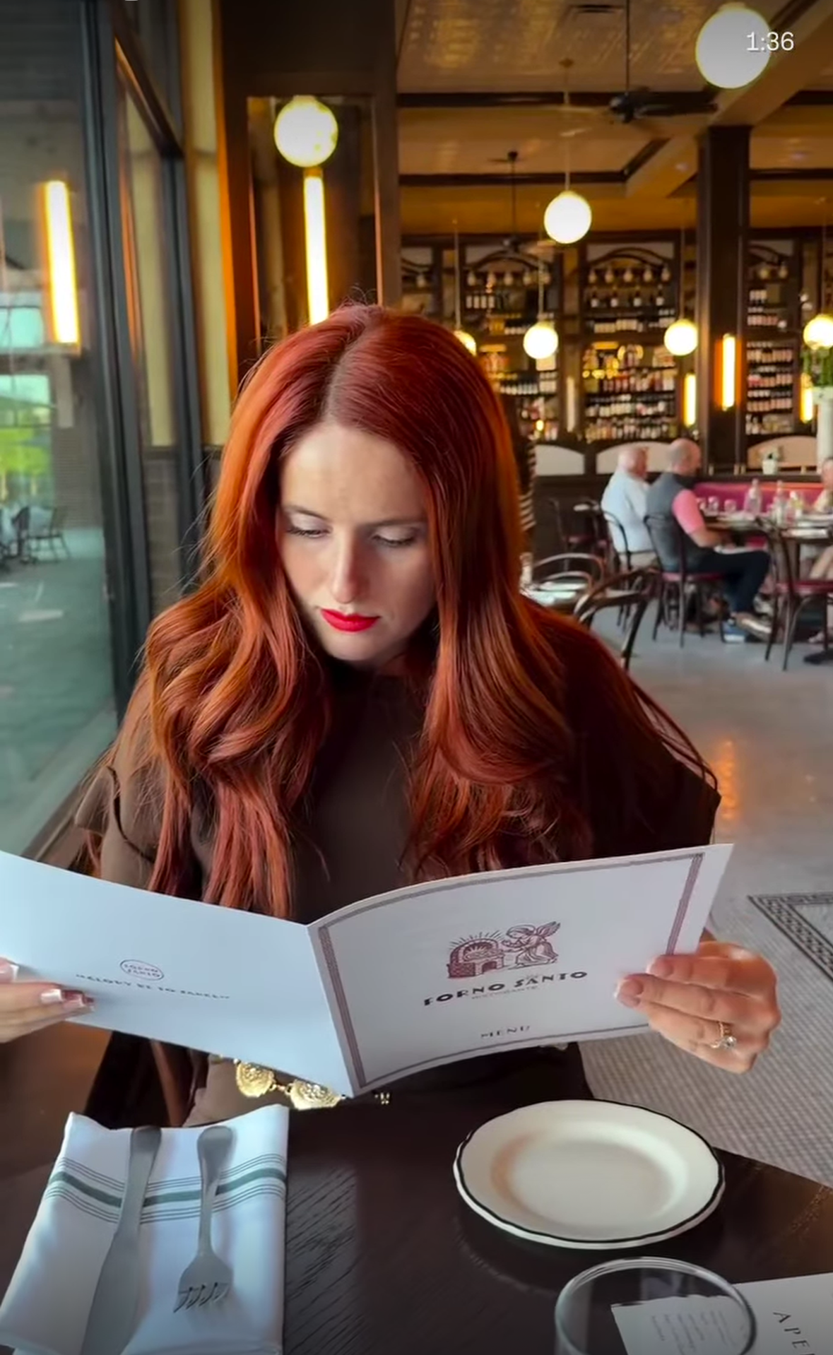
This is Italian-American dining done with reverence.
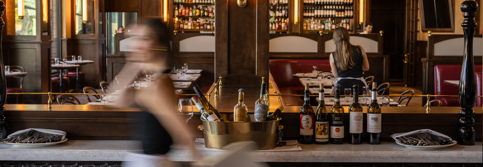
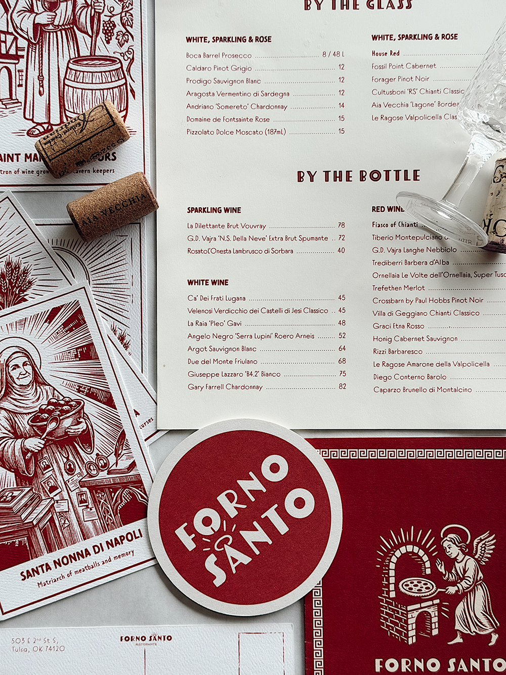
At Forno Santo, meals are shared, Chianti is poured freely, and everything feels touched by time. The space is lively, slightly glamorous, and always familiar. This is the kind of place where everyone eats like family, whether you know them or not.
Visual Identity
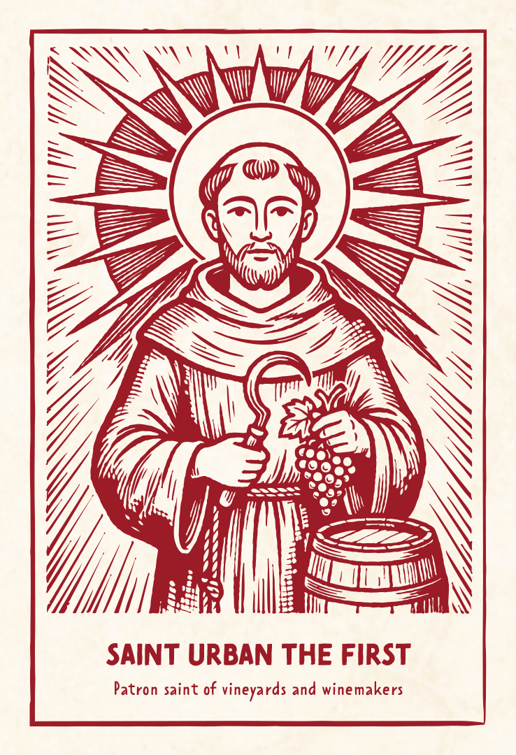
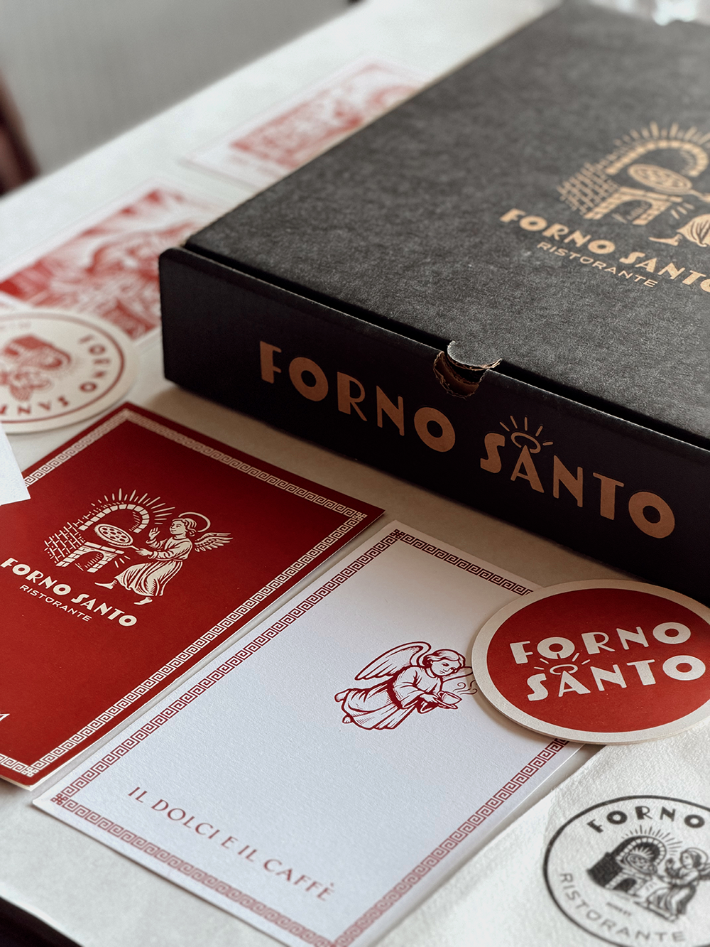
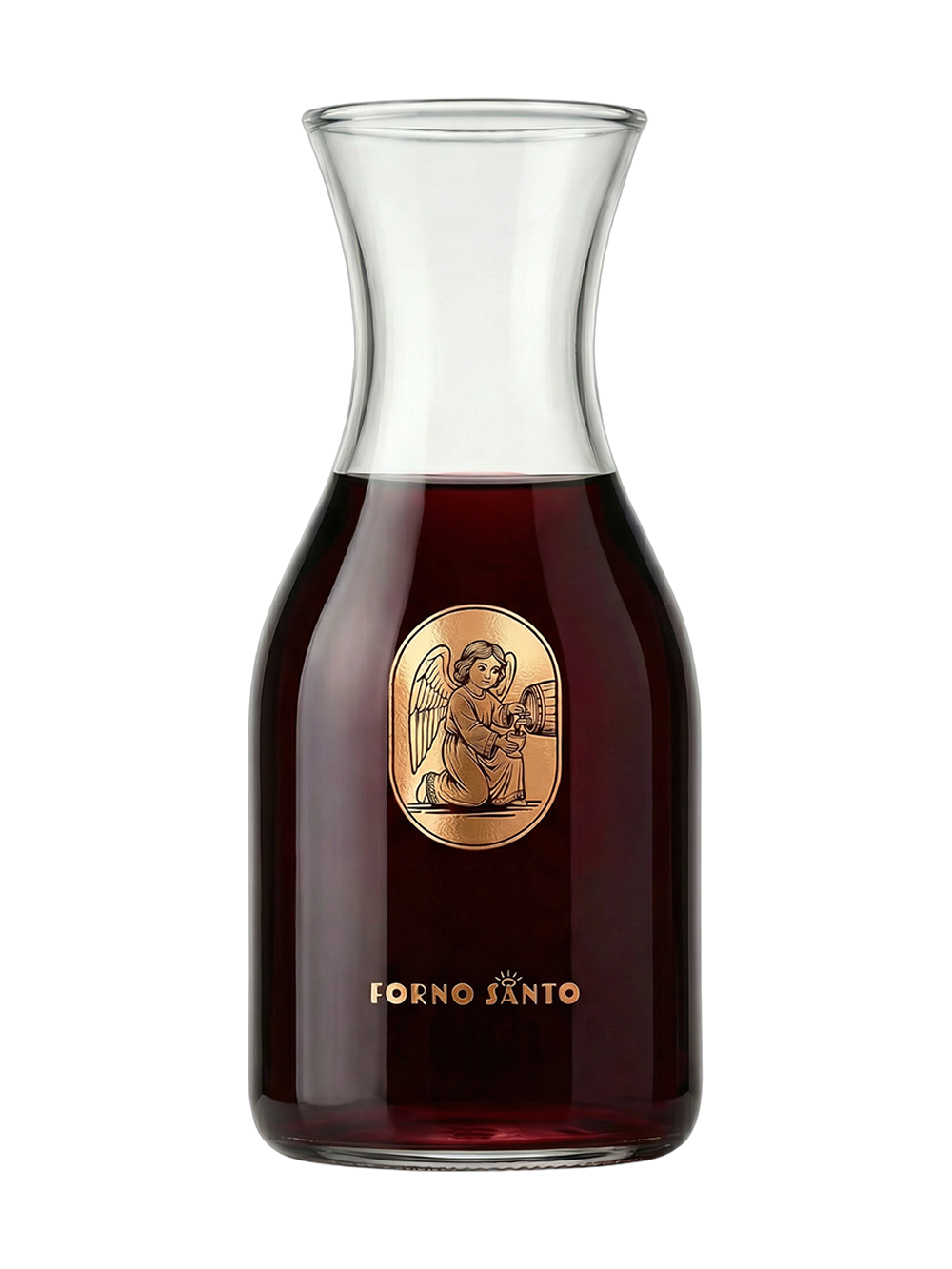
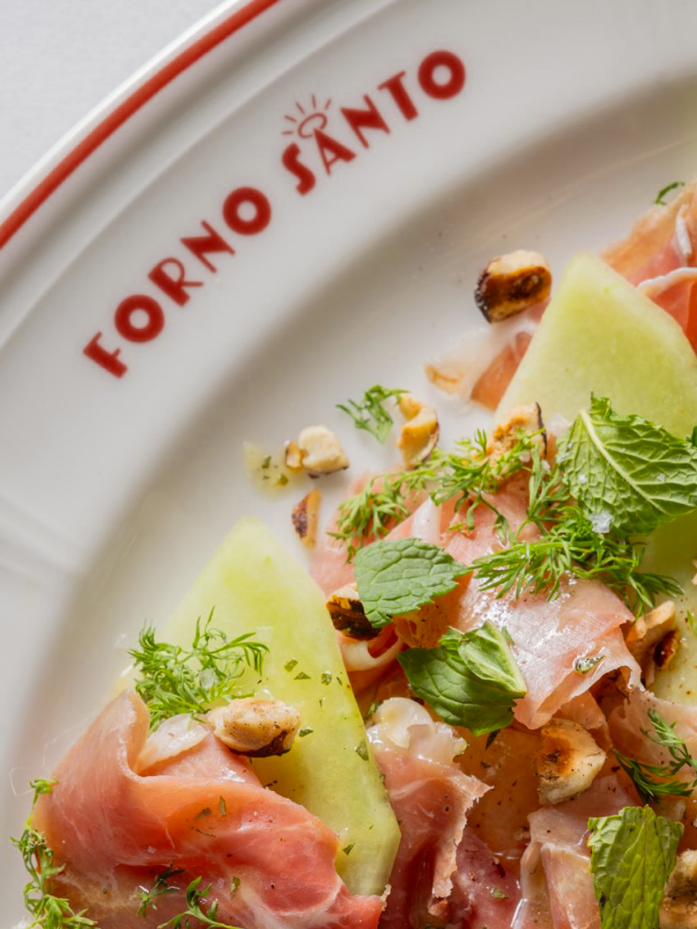
Forno Santo’s identity system was designed to balance reverence with playfulness, drawing equally from Italian devotional iconography, vintage hospitality signage, and the warmth of classic American red-sauce restaurants.
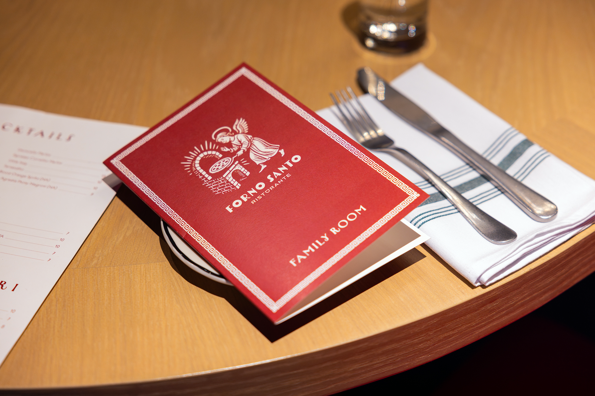
At the center of the system is a custom wordmark featuring a haloed “A,” transforming the restaurant’s name into a subtle symbol of the “Holy Oven.” The typography feels bold, approachable, and slightly Art Deco, allowing the brand to move fluidly between refined applications and more irreverent moments throughout the space.
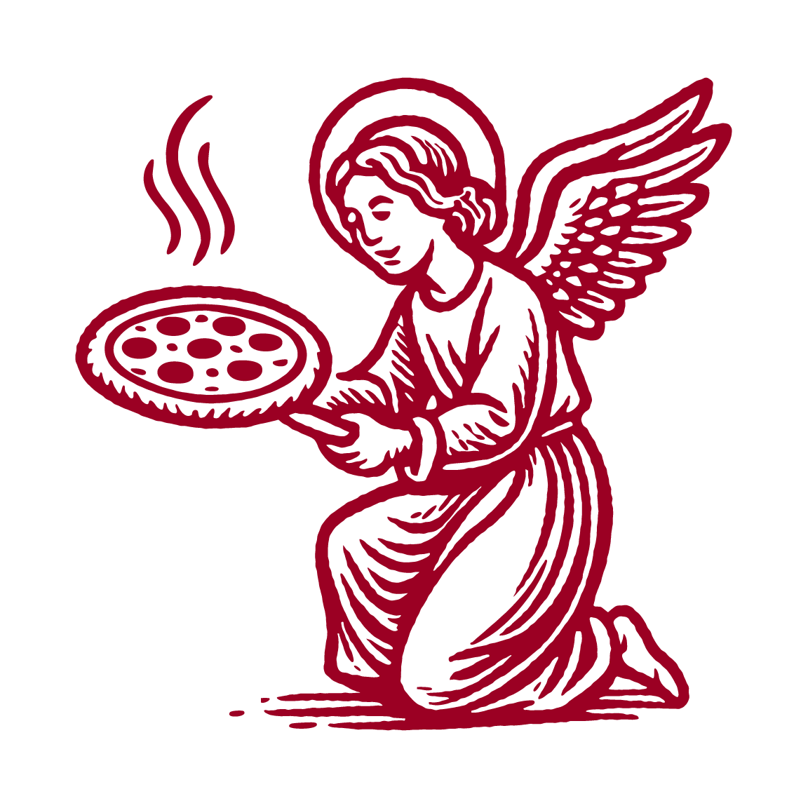
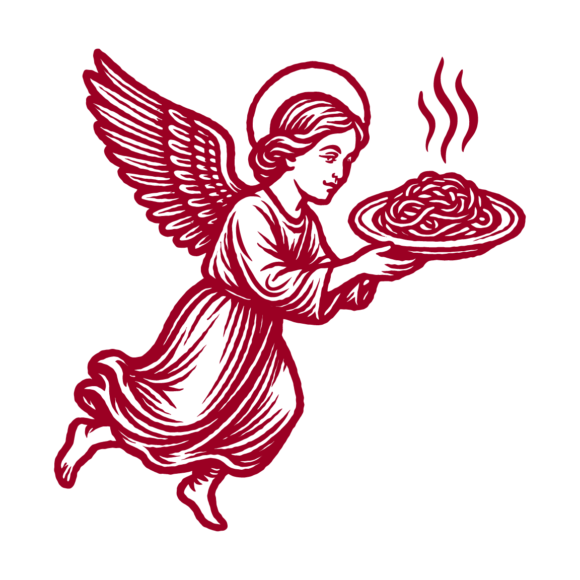
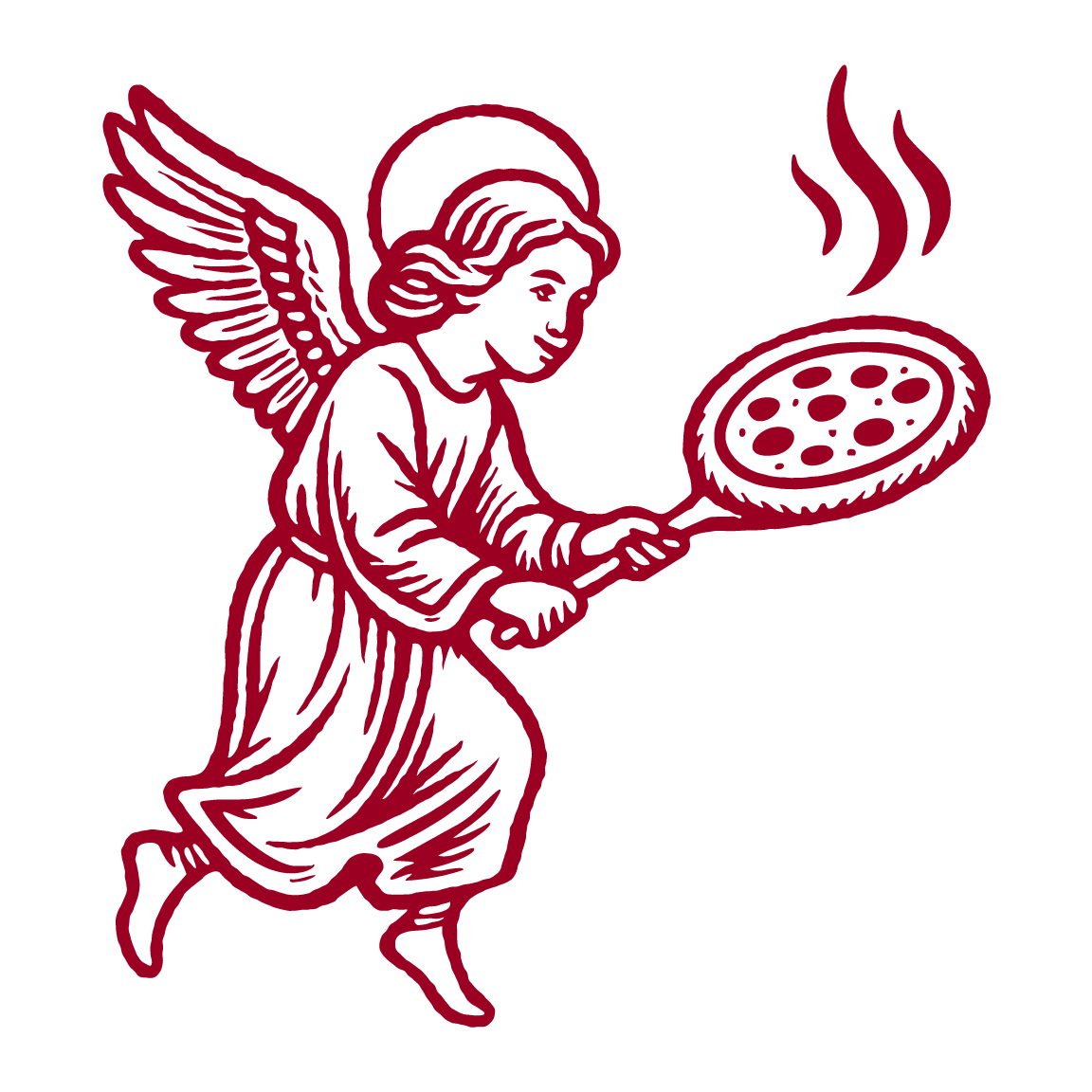
While the core mark appears deceptively simple, the system was built with extensive flexibility in mind. Over the course of the project, we developed a library of 148 logo assets across colorways, lockups, scales, and production formats — allowing the identity to adapt seamlessly across menus, signage, merchandise, social media, environmental graphics, packaging, and animated applications.
Logo Family
8 versions / 124 files
Year
2026


“Not just a restaurant. A ritual.”